There has been more and more research on how to better design figures and color schemes to suit a broader audience. Roughly 8% of men and 0.5% of women have some sort of colorblindness, so if I present a figure during an extension or scientific talk, I really need to make sure that the information comes across correctly.
Luckily, there are lots of great packages out there that give options on what color scales I can use. I really wanted to keep track of some of my favorites, and how I created the visualizations, so this is kind of a short guide on that. There are lots of other resources out there, this is something that I kept going back to as a reference, and wanted to make public.
What Color Scales are Available?
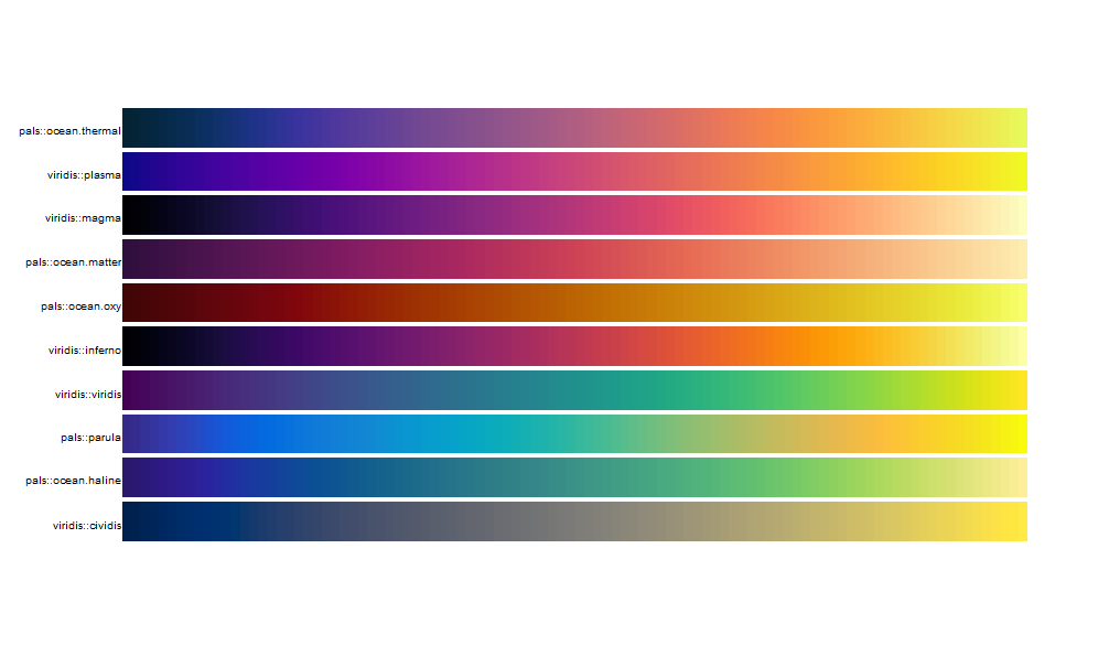
There are many MANY packages that make color palettes, ( paletteer seems to be an R resource for many of them), but the classic that my colleagues and I use alot is viridis, which offers five beautiful palettes. I wanted to compare those five to some others that I found around and thought looked interesting and kind of similar to the viridis five.
pals::pal.bands(pals::ocean.thermal, viridis::plasma, viridis::magma,pals::ocean.matter, pals::ocean.oxy, viridis::inferno, viridis::viridis, pals::parula , pals::ocean.haline, viridis::cividis)

So the palettes that are available through the pals package seem to be useful, and seem to mimic what we see in viridis. I really like the Parula palette, it reminds me of the old-school Matlab plots, very retro chic.
How Colorblind-Friendly are Any of these Palettes?
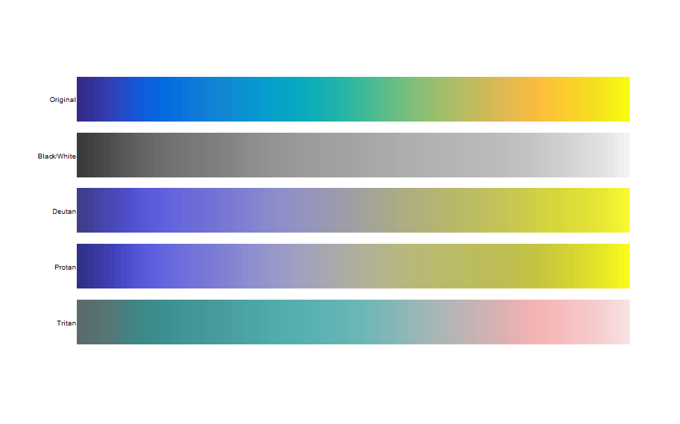
As much as it’s interesting to see the different palettes, we really want to know how they will be perceived by those with different forms of colorblindness. Ideally, we would want a color palette that looks like it ramps fairly smoothly over the entire range, and that the ramp looks uniformly smooth across the different colorblindness types.
pals::pal.safe(pals::parula)

It looks like the Parula palette is fairly safe and uniform for those with BW/Deutan/Protan blindness, but not as uniform for Tritan. Ideally, we would want a palette that can cover all of them. Check out this great article describing the creation of the cividis color palette here, and how it is likely one of the more optimal settings for figures.
What are the Actual Colors?
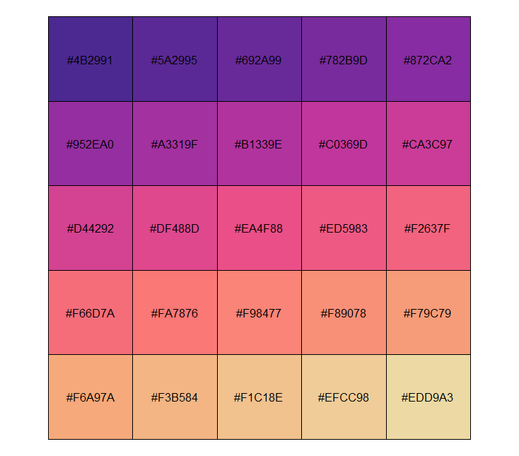
Sometimes you want to use the hex codes involved in the different palettes. I use the scales function show_col to show the different colors, and here I am using the rcartocolor package palette ‘ag_Sunset’, which I find incredibly beautiful.
scales::show_col(colorRampPalette(rcartocolor::carto_pal(name = “ag_Sunset”))(25))

Conclusions?
This is really and truly just the tip of the iceberg, but with a small amount of care, you can easily modify your scientific figures to be more easily and accurately understood by a fairly large chunk of the populace.
